
One attendee enlarges the captions and wants more space between lines. Another prefers a compact view because the speaker's diagram occupies most of the screen. A third wants text available but does not want to read it continuously.
These preferences do not tell you anyone's diagnosis. They tell you what to test. A useful caption experience gives people discoverable choices, supports their existing tools, and provides a route to ask for something different.
This guide treats neurodiversity as a reason to avoid a single assumed reading experience. It does not claim that captions treat a condition, improve every person's working memory, reduce anxiety, or guarantee comprehension. Such outcomes require evidence beyond a product feature or usage chart.
Offer choice without asking people to qualify for it
Explain that reading controls are available to anyone who wants them. Put the instructions where a first-time attendee can find them before the substantive presentation begins. Avoid a separate public signup asking people to describe why they need larger text.
W3C's supplemental cognitive accessibility guidance emphasizes involving users and supporting adaptation and personalization. It is design guidance, not a clinical claim or an additional WCAG conformance requirement. W3C: Making Content Usable for People with Cognitive and Learning Disabilities.
Use that principle in a small, voluntary trial. Invite people to try controls with the actual presentation format, describe obstacles in their own words, and skip any question. Include people with relevant lived experience in a more formal evaluation, with appropriate recognition or compensation. Do not ask one participant to represent everyone.
Start with the controls the product documents
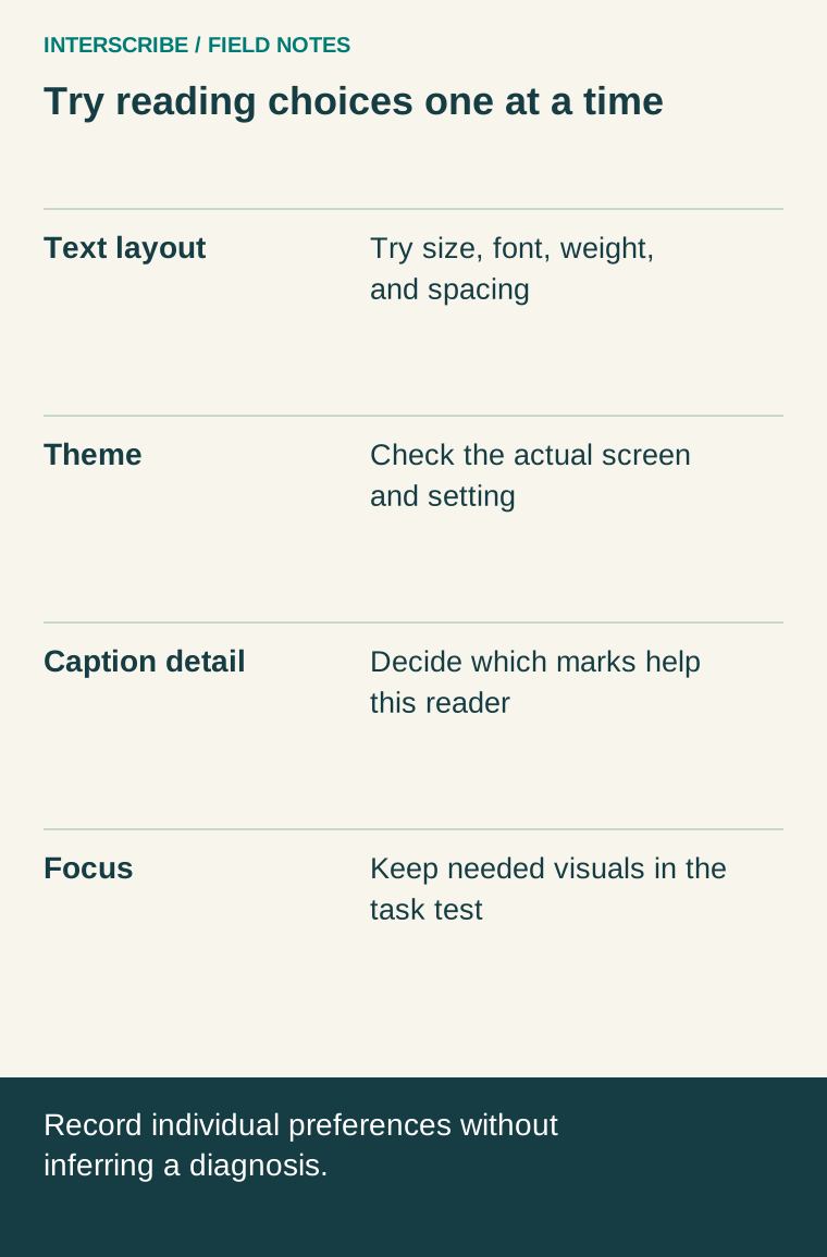
In InterScribe's documented listener page, Settings → Reading offers text size, theme, font, weight, line spacing, and Mark changes, which briefly underlines revised words. The preview helps the listener inspect the setting before following a longer passage.
The reading comfort guide lists the exact choices. Confirm the experience in your account and attendees' devices before distributing instructions. A font named Readable is an option to try, not evidence that it is best for a particular person or condition.
Under Caption details, the documented controls include speaker names, a confidence dot, and marking unsure words. These marks can add information, but they also add visual detail. Explain what they mean and let the person decide whether they help. A confidence indicator expresses the recognizer's confidence; it does not independently verify truth or meaning.
Focus mode gives captions the full screen. That can change the relationship between captions and a slide or video. Test the actual task before encouraging everyone to use it. A person following a detailed demonstration may need the visual material in view too.
Run a short comfort trial with a real task
Use a harmless sample resembling the event: a short explanation, a speaker change, a slide reference, and a question. Avoid collecting sensitive material in the test.
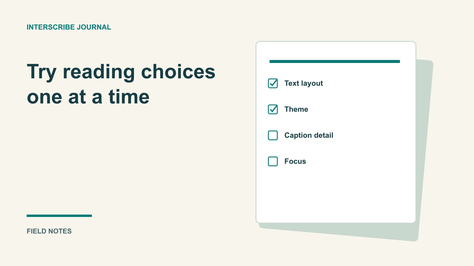
First let the person try the default. Then offer one change at a time if they want to explore. Changing font, size, spacing, theme, and detail simultaneously makes it hard to know which choice addressed the difficulty.
Ask task-specific questions: Could they find the new line? Could they check a term after looking at the slide? Did revised wording draw useful attention or become distracting? Could they return to the current captions after scrolling back?
Do not turn this into a timed reading competition. The purpose is to choose a workable experience and identify barriers, not measure the attendee's ability. A private trial can be more useful than asking someone to explain a preference during a crowded event.
A fictional preference example
In a fictional volunteer-training session, Priya tries captions beside a slide showing several steps. She chooses larger text and relaxed spacing. Those settings make the text easier for her to locate, but on her small screen she now sees less of the slide.
The facilitator does not decide that larger text has “failed.” They try a different teaching sequence: explain one step, pause, show the corresponding visual, and allow questions before moving on. Priya keeps her preferred text settings and describes the revised sequence as workable for that sample.
Another tester, Jordan, prefers the compact default and turns on the marker for changed words. The organizer records both preferences without assigning a diagnosis or selecting one as the official neurodivergent setting.
The example is illustrative. It demonstrates a method for finding an individual fit; it is not research establishing an effect on attention or learning.
Copy this voluntary feedback card
| Prompt | Example of useful feedback | Organizer response |
|---|---|---|
| What were you trying to follow? | A diagram while checking a technical term | Test the combined view and presentation pace |
| Which setting did you try? | Larger text and relaxed spacing | Preserve the choice; explain how to change it |
| What was difficult? | Finding the newest line after looking away | Demonstrate return-to-live behavior and retest |
| Did extra caption detail help? | Changed-word marks were distracting | Explain the control; do not require it |
| What else would help? | Slides before the session | Route the request to the content/access owner |
| May we follow up? | Yes, privately by the agreed route | Collect only the contact detail needed |
Add “prefer not to answer” and a free-text space. If the card is anonymous, do not promise a personal response; provide a separate contact route for requests needing follow-up.
Repair the content and delivery too
Reading settings cannot repair a missing microphone, an incorrect negation, or an unexplained diagram. Ask speakers to define unfamiliar terms, state the relevant visual information, and leave time for questions. Review a representative sample of captions for meaning and corrections.
Use the listener page guide to explain Back to live and the messages people may see during interruptions. Do not tell someone to keep reading indefinitely when their chosen support has stopped or the content is unreliable. The moderator needs a procedure for pausing and clarifying essential information.
If a participant requests another communication arrangement, use your established accessibility process. Making reading controls available is a helpful design choice, not a determination that every need is met.
Evaluate the experience without profiling people
Report the barrier and correction: “The instructions did not explain how to return to current captions; we added that demonstration and retested it.” Avoid statements such as “longer caption use proves improved focus.” Time connected can reflect many things and does not identify a person's cognitive state.
Keep feedback about tasks separate from sensitive accommodation records. For broader event feedback, ask which activity was difficult to follow and what would help, using the voluntary card above. Use the analytics interpretation guide for counting limits. Preserve useful choices, fix observed obstacles, and let attendees change their approach when the environment or task changes.